You approved a brilliant logo, but the keychain samples are a disaster. The metal one lost all its detail, the PVC version looks like a toy, and the leather one is barely visible. Now your brand looks inconsistent and unprofessional.
Your logo looks different because each material—metal, PVC, leather, or fabric—has unique properties and requires different manufacturing processes like engraving, molding, or stitching. These methods fundamentally alter your logo's texture, color fidelity, and level of detail.
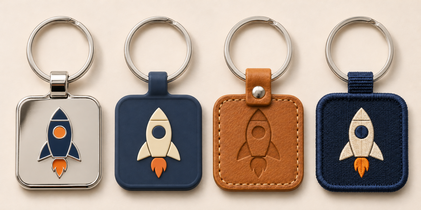
As a product design consultant, this is one of the most common frustrations I see from other designers. They spend weeks perfecting a logo on-screen, only to be shocked by the physical samples. The truth is, a logo is not just a static image; it's an element that has to be translated by a physical process onto a physical material. Understanding how each material and process works is the only way to predict the outcome and ensure your brand looks great, no matter the medium. Let’s dive into why this happens and how you can control it.
How Does Metal Change Your Logo's Appearance?
Your elegant logo with fine lines and subtle colors looks clunky and flat on the metal keychain sample. The premium feel you wanted is gone, replaced by something that feels generic and cheap.
Metal changes your logo through processes like engraving or enamel filling. Engraving etches the surface for a clean, single-color line. Enamel fill uses recessed areas for bold, flat colors, which cannot reproduce gradients and will simplify intricate details.
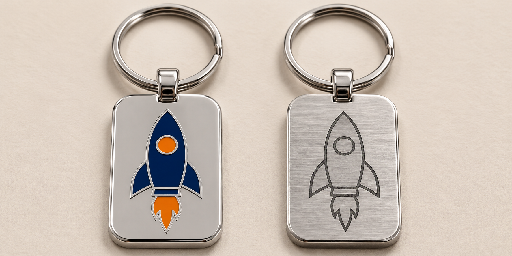
Metal is a fantastic choice for a premium, durable keychain, but it has strict manufacturing rules. You can't just print on it like paper. When a client wants a high-end metal keychain, I immediately ask them to forget about gradients and photorealism. We have to think in terms of lines and solid color fields. The two main methods are enamel fill and engraving. Enamel provides vibrant color but requires simplified artwork with clear separations between colors, like a coloring book. Engraving offers incredible precision for lines but no color at all. Both methods force you to adapt your design, but the result is a keychain with a satisfying weight and permanence that other materials can't match.
Metal Manufacturing Techniques Explained
The method used to apply your logo to metal is everything. Each one creates a distinct look and feel.
| Technique | Best For | Visual Outcome |
|---|---|---|
| Soft Enamel | Bold, colorful logos | Textured surface with recessed colors, vibrant and cost-effective. |
| Hard Enamel | Premium, flat designs | Smooth, polished surface, colors are flush with the metal lines. |
| Laser Engraving | Highly detailed logos, text | Sharp, precise, single-color lines etched into the metal surface. |
Soft enamel is the most common. The die-cast metal has raised lines, and liquid enamel is poured into the recessed areas. This creates a tactile, dimensional effect. Hard enamel is similar, but the keychain is overfilled with enamel and then polished down until it is completely smooth and flush with the metal lines. It looks and feels more like high-end jewelry. Finally, laser engraving uses a beam of light to etch away the surface of the metal, creating a clean, permanent mark. It's perfect for complex line art but offers no color.
Why Does PVC Make Your Logo Look So Different?
You wanted a modern keychain, but the PVC sample looks more like a children's toy. The colors are bright and the shape is accurate, but the overall effect is too playful for your brand.
PVC makes your logo look different because it is molded in distinct 2D or 3D layers of color. This creates a soft, rubbery, and dimensional product. The process requires separating colors into solid blocks, which fundamentally alters logos with gradients or fine details.
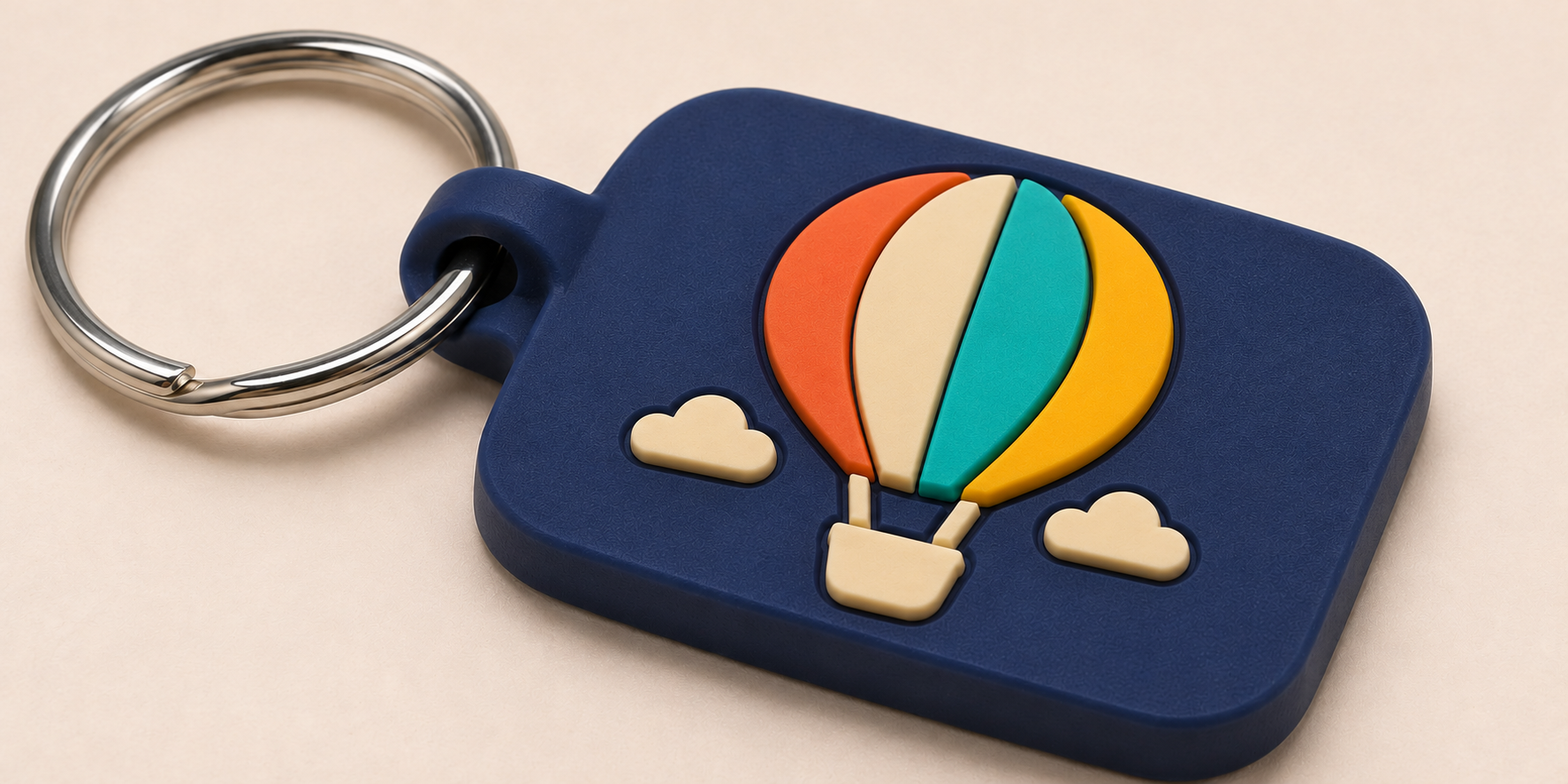
When a designer hands me a logo for a PVC keychain, the first thing I do is check for gradients and tiny, overlapping details. Why? Because the PVC manufacturing process cannot handle them. Each color in your design is a separate layer of liquid PVC that is poured into a custom mold. There is no blending. This forces a simplification of the design into bold, graphic shapes. The result is a fun, vibrant, and highly tactile keychain that is durable and waterproof. It’s perfect for modern, youthful, or rugged brands. However, if your brand identity is built on subtlety, elegance, or photorealism, PVC is absolutely the wrong choice. It has a strong personality, and your logo must be adapted to fit it.
The Impact of 3D Molding
The layering process is what gives PVC its unique character.
- 2D vs. 3D: A 2D design has all the top surfaces on one flat plane, though colors are still recessed. A 3D design has elements at different heights, creating a sculptural, multi-level effect that you can feel. This adds significant perceived value and uniqueness.
- Color Separation: Every color needs to be bordered by a small channel or "wall" in the mold. This is why elements cannot touch or blend. You must work with your supplier to create a "production-ready" version of your artwork that has these separations.
- Feel and Function: The final product is soft, flexible, and nearly indestructible. This makes it perfect for outdoor brands, event promotions, and any context where durability is key. It won't scratch other items in a pocket or purse.
What Happens to Your Logo on Fabric or Leather Keychains?
The logo on your leather keychain sample is barely visible, and the one on the embroidered version has lost all its sharp corners. You wanted a classic, high-end feel, but the execution looks sloppy.
On leather, logos are debossed or hot-stamped, creating a subtle, tonal impression that can lose fine detail. On fabric, embroidery uses thick thread that rounds sharp corners and cannot reproduce small text, simplifying your design into a textured, stitched form.
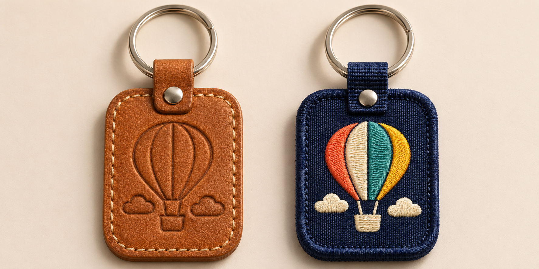
Leather and fabric are "soft" materials that communicate warmth and quality, but they are also the most challenging for logo reproduction. You are not printing; you are physically altering the material's surface. For a premium accessories brand I consulted for, we wanted to use leather key fobs. Their logo had very fine script. The first debossed samples were a failure—the text was illegible. We had to create a simplified, bolded version of the logo specifically for this application. It’s the same story with embroidery. A logo designed for print will always need to be simplified and digitized for stitching, which involves thickening lines and increasing the size of text. The result is a beautiful, classic keychain, but only if you design for the medium.
Adapting Your Design for Soft Materials
Success with these materials is all about simplification.
| Material | Primary Technique | Key Consideration |
|---|---|---|
| Leather/Faux Leather | Debossing / Hot Stamping | Simplify to bold lines. Fine details will be lost. The effect is subtle and tonal. |
| Fabric (Felt/Twill) | Embroidery | Thicken all lines and enlarge text. Sharp corners will become rounded. |
| Fabric (Canvas/Nylon) | Screen Printing | Can hold more detail than embroidery, but texture of the fabric may affect sharpness. |
For leather, think of it as creating a stamp to press into the material. If the stamp's details are too fine, the impression will be muddy. For embroidery, think of drawing with a thick crayon. You can create a beautiful image, but you can't draw a photorealistic portrait. Always ask your supplier for the minimum line thickness and text height for their process before you even begin adapting your design.
How Can You Ensure Logo Consistency Across All Materials?
You need keychains in metal, PVC, and leather for different product tiers, but you're worried they'll look like they came from three different companies. You need a strategy to maintain a consistent brand identity.
Create a "Logo Usage Guide" for physical products. This includes simplified, single-color, and bolded versions of your logo. Use this toolkit to apply the most appropriate version to each material, ensuring a consistent brand feel, even when the details vary.
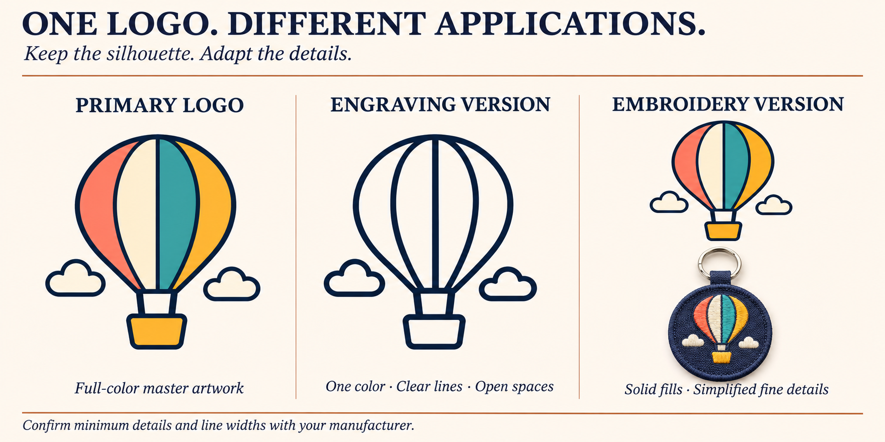
True brand consistency isn't about making the logo look identical everywhere—that's impossible. It's about making it feel like the same brand everywhere. As a consultant, this is one of the most valuable assets I help clients create. Instead of having one "master" logo, you create a flexible identity system. You have your full-color, detailed logo for print and web. Then you create a simplified, one-color version for applications like laser engraving or leather debossing. You might also create a "chunky" or bolded version specifically for embroidery. This isn't brand dilution; it's brand intelligence. It shows you understand the physical world and have planned for it. It ensures every product, no matter the material, looks intentional and professional.
Building Your Physical Product Logo Toolkit
Your toolkit should be part of your official brand guidelines.
- Primary Logo: The full-color, detailed version. Use this for printed inserts or full-color metal keychains if the process allows.
- One-Color Version: A simplified logo rendered in a single solid color (positive and negative). This is your go-to for laser engraving, debossing, and single-color screen printing.
- Simplified/Icon Version: An alternate logo that uses only the most recognizable element of your main logo. This is perfect for small applications like the metal rivet on a leather fob.
- Embroidery Version: A specially digitized file where all lines are thickened and small gaps are enlarged to prevent thread bunching.
By having these assets ready, you're not reacting to bad samples. You are proactively directing your manufacturer to produce a great product from the start.
Conclusion
Your logo changes on different keychain materials due to their unique properties and production methods. By understanding these differences and preparing alternate logo versions, you can ensure a professional, consistent brand identity.